LPM Gallery & the Nick Cave Art Collection

A Dilapidated Workshop Becomes an Eclectic, Live/Work Haven for Artists Nick Cave and Bob Faust

When artist couple Nick Cave and Bob Faust purchased the building, it was in rough condition. Portions of the roof structure were in disrepair and collapsing, windows were broken, and the basement had water damage. Many of the large openings had been filled in, giving the building a monolithic, uninviting feel. “It was essentially an abandoned building,” says architect Carlo Parente. “They were very clear on the spaces they needed for working and living, and the organization of these spaces. They stressed the importance of open and flexible spaces, including the ability to display their works of art.”

 
“The most costly part of the project was the storefronts on both sides of the building—a result of the remedial work that the structure and masonry required,” says Parente. “It was definitely worth it, as the seamless expanse of glass reinforces the building’s street-level prominence. It also allows for the quality of the light in the studio, which is important to the feel of the space. It’s dramatically different from the dark, cavernous space that was there before.”
 
“The boundaries between spaces tend to hybridize and blur, just as I believe the boundaries between their personal and work lives may sometimes blur,” says architect Carlo Parente. “There are design elements woven through both levels that allow for a sense of openness—such as the free plan and the large openings and pivoting walls. At the same time, it’s a place of refuge for Nick and Bob—and the more private and personal spaces allow them to detach.”
 
“It was a journey to get in this space, but with each load unpacked, we saw how all the decisions made sense and supported the ideas of flexibility and workflow,” says Bob Faust. “All the materials found a place to be stored carefully, all the art found a wall, and all the people had a space to call their own. Facility really turned out to be a warm place to work and live—and it keeps surprising and inspiring us.”
 
Artist couple Nick Cave and Bob Faust work with Carlo Parente Architecture to craft a creative space in a 1920s industrial building in Chicago.
 

Stretching across an entire block in Chicago’s Irving Park neighborhood is an unusual brick building that’s part home, part studio, and part creative hub. The 1920s manufacturing building and former mason’s workshop had fallen into disrepair before being transformed into a space that celebrates creative pursuits and community. Known as Facility, it’s a unique undertaking by renowned artist couple Nick Cave and Bob Faust with architect Carlo Parente.

Exterior, Flat RoofLine, Brick Siding Material, and House Building Type When artist couple Nick Cave and Bob Faust purchased the building, it was in rough condition. Portions of the roof structure were in disrepair and collapsing, windows were broken, and the basement had water damage. Many of the large openings had been filled in, giving the building a monolithic, uninviting feel. "It was essentially an abandoned building," says architect Carlo Parente. "They were very clear on the spaces they needed for working and living, and the organization of these spaces. They stressed the importance of open and flexible spaces, including the ability to display their works of art."


When artist couple Nick Cave and Bob Faust purchased the building, it was in rough condition. Portions of the roof structure were in disrepair and collapsing, windows were broken, and the basement had water damage. Many of the large openings had been filled in, giving the building a monolithic, uninviting feel. “It was essentially an abandoned building,” says architect Carlo Parente. “They were very clear on the spaces they needed for working and living, and the organization of these spaces. They stressed the importance of open and flexible spaces, including the ability to display their works of art.”

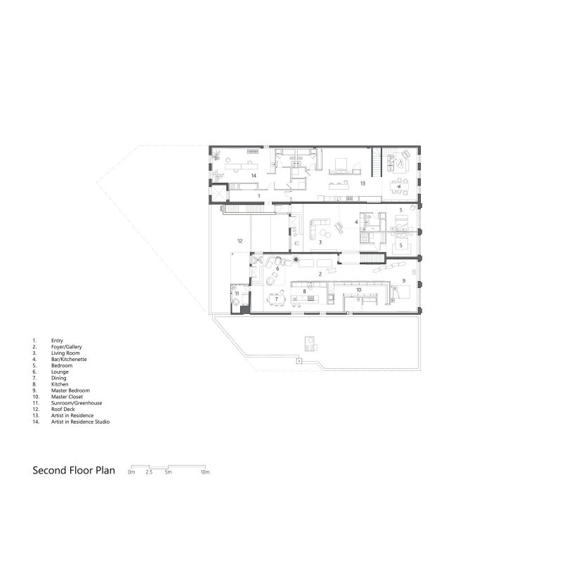
Nick Cave is a fabric sculptor, dancer, and performance artist who is best known for joyful and whimsical work, such as his wearable fabric Soundsuit sculptures. Bob is an artist, designer, and the founder of the cultural branding and communications studio, Faust. The couple founded the Facility arts foundation, which is based on the ground floor, and they live in the second-floor apartment with Bob’s daughter, Lulu.

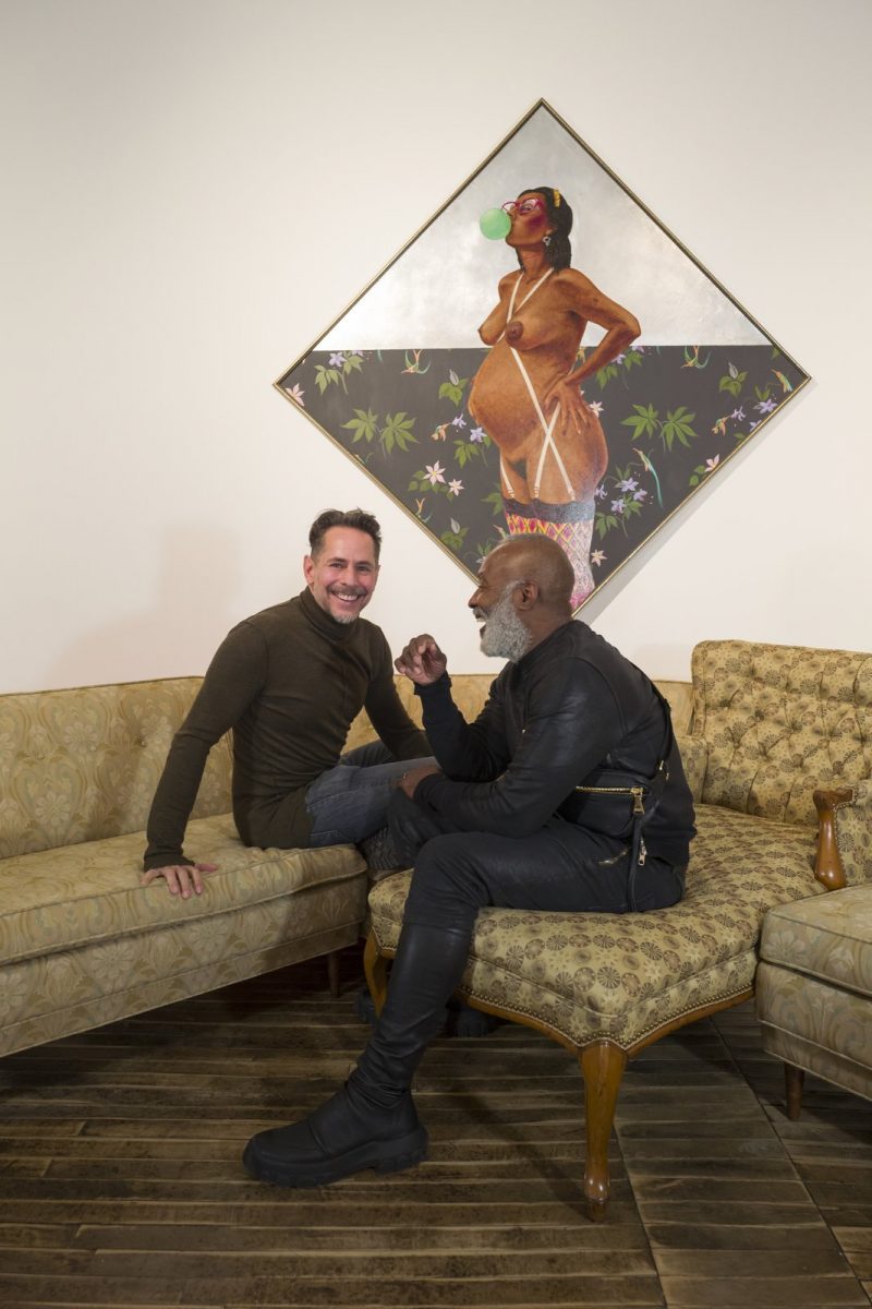
Bob Faust and Nick Cave in the living room of their apartment, which is located on the first floor of the Facility building.


Bob Faust and Nick Cave in the living room of their apartment, which is located on the first floor of the Facility building.

Michelle Litvin


Exterior, House Building Type, Flat RoofLine, and Brick Siding Material "The most costly part of the project was the storefronts on both sides of the building—a result of the remedial work that the structure and masonry required," says Parente. "It was definitely worth it, as the seamless expanse of glass reinforces the building’s street-level prominence. It also allows for the quality of the light in the studio, which is important to the feel of the space. It’s dramatically different from the dark, cavernous space that was there before."


Office, Library Room Type, Medium Hardwood Floor, Chair, Shelves, and Desk The library by the entry forms a key part of the public spaces and adjoins the In and Out Gallery, which is a flexible space accessible from both the north and south streets. It’s open by invitation and hosts various exhibitions and events. 


Medium Hardwood Floor and Hallway "The biggest challenge with older buildings is always the unknowns—opening up a building disturbs what has not been touched for decades," says Parente. "This really became apparent with the storefronts when we removed the infill blockwork to reveal decaying lintels. We developed cost-effective solutions that salvaged as much of the existing structure as possible."


Office and Study Room Type Nick Cave’s workshop space on the ground floor features the original concrete columns. "There were signs squatters had occupied the space—graffiti on walls and left-behind trash," says Parente. "Most of the graffiti was cleaned, but portions were also left as evidence of this chapter in the building’s history and narrative."


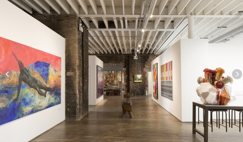
Circulation channels lie between the two studios on the ground floor. These spaces are wider than conventional corridors, and the walls are populated with art. This allows the area to maintain its function as a circulation space while also having the potential to perform as a gallery, a gathering space, a runway, or a performance venue as needed. This part of the gallery features a painting by Cy Gavin and a sculptural work by Matt Wedel.


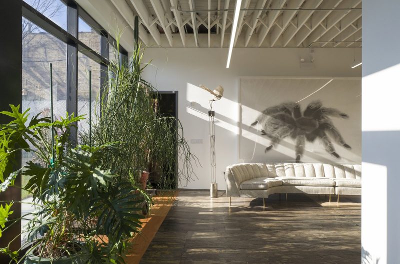
Office and Medium Hardwood Floor Nick Cave’s studio lounge features a kinetic sculpture by Christopher Furman and a large-scale spider drawing by London-based artist Margarita Gluzberg.


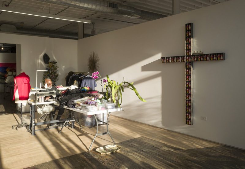
Office, Study Room Type, Chair, Medium Hardwood Floor, and Desk Nick Cave’s area of his studio features a large artwork in the shape of a cross by the artist himself. 


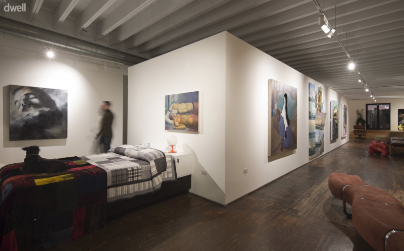
Bedroom, Bed, Lamps, Track Lighting, Medium Hardwood Floor, and Ceiling Lighting "The boundaries between spaces tend to hybridize and blur, just as I believe the boundaries between their personal and work lives may sometimes blur," says architect Carlo Parente. "There are design elements woven through both levels that allow for a sense of openness—such as the free plan and the large openings and pivoting walls. At the same time, it’s a place of refuge for Nick and Bob—and the more private and personal spaces allow them to detach."


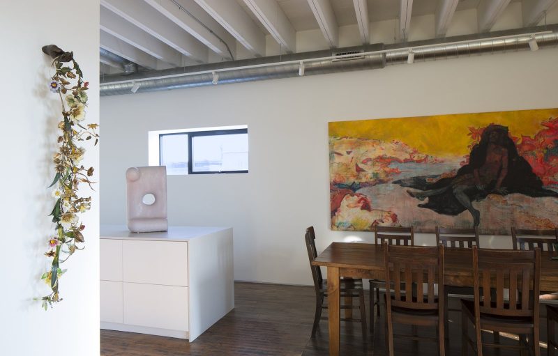
Dining Room, Track Lighting, Chair, Table, Ceiling Lighting, and Medium Hardwood Floor A large painting by New York–based artist Cy Gavin sits alongside the dining table, which is directly adjacent to the kitchen.


Kitchen, Ceiling Lighting, Quartzite Counter, Cooktops, Medium Hardwood Floor, Dishwasher, Track Lighting, Drop In Sink, Refrigerator, Microwave, Wall Oven, and White Cabinet The kitchen features clean, white surfaces and stainless-steel appliances that offer a sleek, minimal backdrop for the artwork. The floral work hanging on the wall by the kitchen is by Nick Cave, the work on the rear wall of the kitchen is by Block 37, and the sculpture on the kitchen bench is by Del Harrow.


Stone Tile Wall, Stone Counter, Open Shower, Bath Room, and Limestone Floor Off-the-shelf materials—such as the tiles and simple faucets in the main bathroom—were selected to help manage the budget.


Bedroom, Bed, Medium Hardwood Floor, Ceiling Lighting, Lamps, and Track Lighting "Given that the apartment is just for ourselves and my daughter Lulu, we were able to eliminate the need for most doors completely," says Bob Faust. "Given the layout and flow, we all can find private spaces as needed without ever feeling like anything is closed off completely. The beauty of not having doors is how the light transitions all the way through the apartment from north to south, over walls and through chases of space that are more like galleries than hallways." The painting in the bedroom is by Aaron Gilbert, and the work in the living room is by Kehinde Wiley. 


"Carlo came up with a pivoting wall system that is used primarily when events come indoors and we need to separate the studio from the more public galleries and common space," says Bob Faust. "The system creates good separation when needed for security reasons, but the walls disappear when not in use so you feel like there are no doors anywhere. It feels like a giant loft space with infinite possibilities." This part of the gallery features a sculptural work by Matt Wedel, a print by Hank Willis Thomas, and a work by Nick Cave.


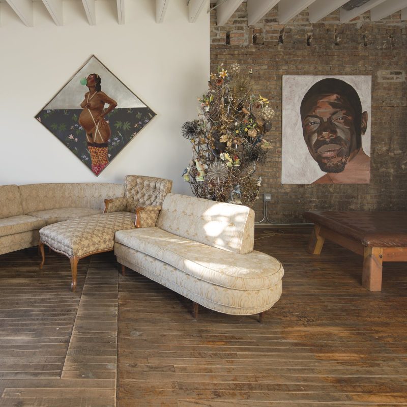
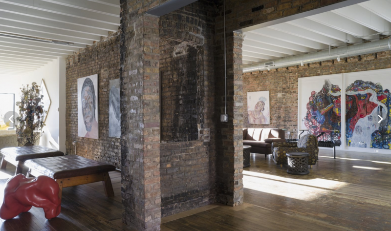
Living Room, Coffee Tables, Track Lighting, Ceiling Lighting, Medium Hardwood Floor, and Sofa Artwork in the living room includes a painting by contemporary American painter Barkley L. Hendricks, a sculptural floral work by Nick Cave, and a portrait by Parrison. 


Living Room, Chair, Sofa, Track Lighting, Medium Hardwood Floor, and Ceiling Lighting The budget was managed by keeping the material palette simple—including the use of construction materials that aren’t typically exposed, such as the AC plywood used for the timber stair that connects the living room to the rooftop deck. Reusing many of the existing materials also allowed the team to stay mostly within budget.


Living Room The plywood stairs that lead to the terrace from both the living room and the family room are a solution to the challenge of wildly varying floor heights. "Carlo solved this with what turned out to be a defining design element," says Bob Faust. "We now have platforms that usher you in and our generously. They also act as alternative seating and art spaces." On display in the family room is an African ladder, and an artwork by Block 37.


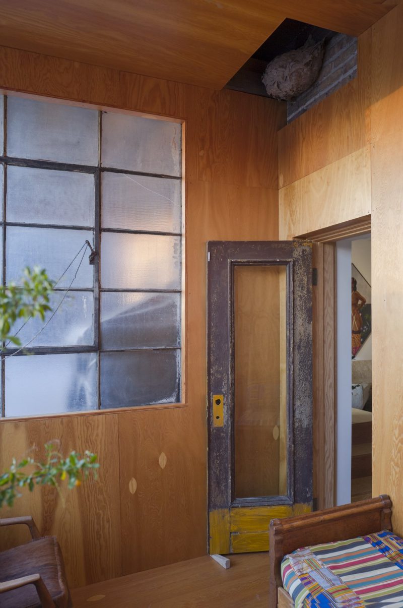
Outdoor, Rooftop, Wood Patio, Porch, Deck, and Large Patio, Porch, Deck "My favorite space in the whole building is the little sunroom off the living area of our apartment," says Bob Faust. "It is an unconditioned space that stays warm in winter due to the sun exposure and cool in the summer because it completely opens up to the outside. I have a coffee in there every morning, and it became my yoga studio throughout the COVID lockdowns. It is kind of like a Michigan cabin on the roof of our studio."


The former life of the old building is celebrated throughout, with many of the original features preserved. Even a large, inactive wasp nest in the sunroom on the rooftop has been preserved. 


Living Room, Sofa, End Tables, Medium Hardwood Floor, Bench, Track Lighting, and Ceiling Lighting "It was a journey to get in this space, but with each load unpacked, we saw how all the decisions made sense and supported the ideas of flexibility and workflow," says Bob Faust. "All the materials found a place to be stored carefully, all the art found a wall, and all the people had a space to call their own. Facility really turned out to be a warm place to work and live—and it keeps surprising and inspiring us."  


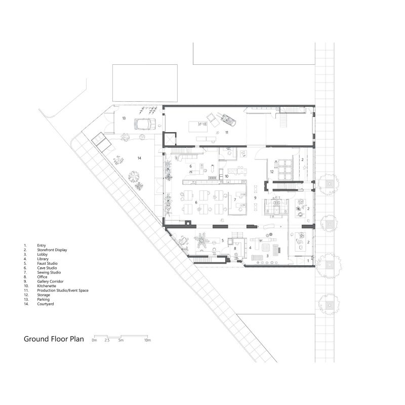
Ground-level floor plan of Facility by Carlo Parente Architecture


Second-story floor plan of Facility by Carlo Parente Architecture, showing the private living spaces.


Pin It on Pinterest

Share This